Bridget Riley
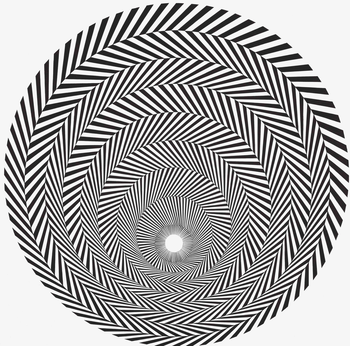
Blaze 4.
On one hand Blaze 4 is a simple design concept: a series of concentric circles, lines angled in alternating directions. The kind of thing that, in the hands of someone less attuned to detail, would be a muddled mess, or almost silly, like a picture of spiraling tweed. But in the hands of master contemporary artist Bridget Riley, it’s a buzzing, vertiginous image, the sort of thing that requires a warning label for people sensitive to strobes. It’s a perfect marriage of form and technique, and that the effect is so visceral is argument enough for why the Yale Center for British Art has dedicated two floors of the museum to a massive retrospective of the celebrated artist’s work, called “Bridget Riley: Perceptual Abstraction” — and there are just two more weekends to see it before it closes on July 24.
The exhibition, as an accompanying note states, “was conceived” by the artist, who is now 91 years old, along with Courtney J. Martin, Maryam Ohadi-Hamadani, Martina Droth, Charlotte Lefland, and Rachel Stratton of the YCBA, and is the largest show of the artist’s work in the United States in 20 years.
Born in 1931, Riley quickly became a internationally known artist in her early 30s. By 1965, the British artist had a piece included in a show at the Museum of Modern Art in New York. In the early 2000s, a few of her paintings were sold at auction for millions of dollars. It’s easy to see why by visiting the show — and only by visiting the show. Like Mark Rothko’s abstract paintings, there’s something about Riley’s work that doesn’t translate in reproduction. Prints of them (or, for that matter, the wonderfully rendered photos in this article, courtesy of YCBA) show the cleverness of the designs. In person, however, they are dizzying, mesmerizing, engrossing, and in some cases, nauseating and headache-inducing.
“In the early 1960s, Riley worked exclusively in black and white. The lines, curves, circles, and triangles arranged across her surfaces result in energetic patterns, which appear to shift and pulse in space,” an accompanying note explains. That’s putting it mildly. I found myself completely drawn in and also a little repulsed by some of the early black and white pieces. Judging from the reactions of those around me, I wasn’t alone.
“Pretty intense exhibit to be stationed in,” I said to the guard in the gallery. He just chuckled, like you got that right.
The strength of people’s reactions to the pieces is made that much more impressive in reading the accompanying booklet YCBA has put together for the exhibit, while reveal Riley as much more concerned with the formality of her ideas than the emotional impact of each canvas. But she also comes across as someone who knew exactly what feelings she could produce with her geometric shapes.
By 1966 she began to expand her palette, first to gray. “creating a completely new sensory response,” the accompanying text reads. “Here, perception is slowed down through the appearance of depth and spatial recession. Riley has described this use of gray as a testing ground and a bridge she had to cross to meet the challenges of color.”

Bridget Riley
Streak 3.
Meet that challenge she did. The above note sounds overblown, but it turns out that adding color really did transform Riley’s work, to the point where it opens up questions about how it is our eyes and brains work in how we perceive black and white versus color. Where Riley’s black and white designs feel jarring and aggressive, her color designs — which are often geometrically similar to her previous black and white work — are soothing, more like watching ocean waves or campfires. Perhaps this has to do with her color choices; in moving away from black and white, she didn’t go to primary colors, but to more subtle shades that defy easy description, and that blend with one another in harmonious ways. This isn’t surprising when we learn about her inspiration from an accompanying note: “Riley’s ideas about color were profoundly shaped by her experience of nature, both at home and on her travels. Riley’s visits to Australia, Egypt, and the islands of Bali, Java, Japan, and Tahiti prompted an expansion in her palette.”

Bridget Riley
Rêve.
You could argue in the course of her career Riley has pushed those ideas about as far as they can go, even as she comes full circle by drawing from the ideas of past masters. In Rêve Riley “further develops color as a spatial element,” an accompanying note reads. “These paintings evoke the paper cutouts of Henri Matisse and the work of Paul Cézanne — artists Riley has carefully studied.” The shapes and colors “create the impression of shallow spaces within and above the picture plane. As Riley explains, ‘When played through a series of arabesques, the curve is wonderfully fluid, supple, and strong. It can twist and bend, flow and sway, sometimes with the diagonal, sometimes against, so that the tempo is either accelerated or held back, delayed.’ ” The journey from tension to relaxation, from agitation to a kind of flickering peace, has for Riley been the work of a lifetime, and in YCBA’s engrossing exhibit, it’s a privilege to take it with her.
“Bridget Riley: Perceptual Abstraction” runs at the Yale Center for British Art, 1080 Chapel St., through July 24. Admission is free. For hours and more information, visit the gallery’s website.